Carpet Design
Inspiration happens everywhere.
Close your eyes and imagine... Open your eyes and search for what speaks to you.
DO YOU SEE IT?
This is not your “momma’s carpet”. While each person has a unique sense of style which should be reflected in your surroundings, there is a good rule of thumb. Less is sometimes more when it comes to carpet. Flash back to your youth and remember the lack of consistency and the different colors/patterns on the floor.
Core Colors - Floors and Walls
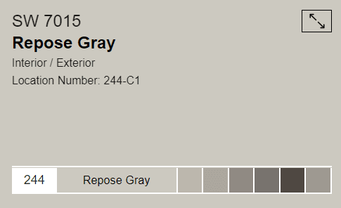
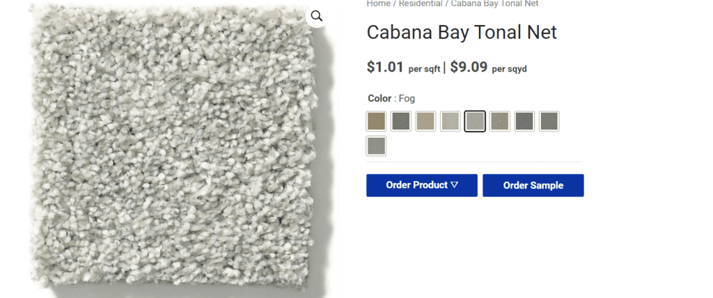
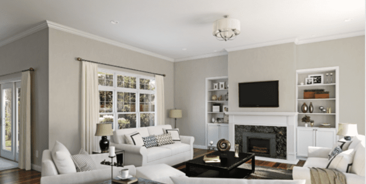
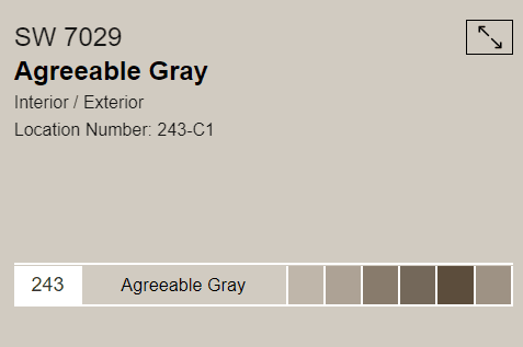
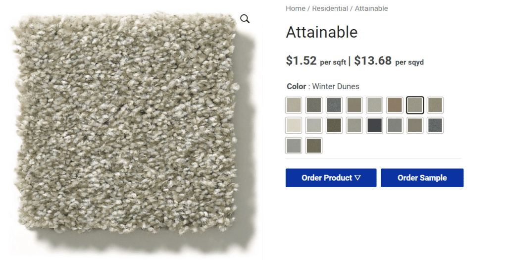
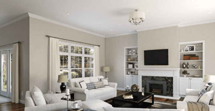
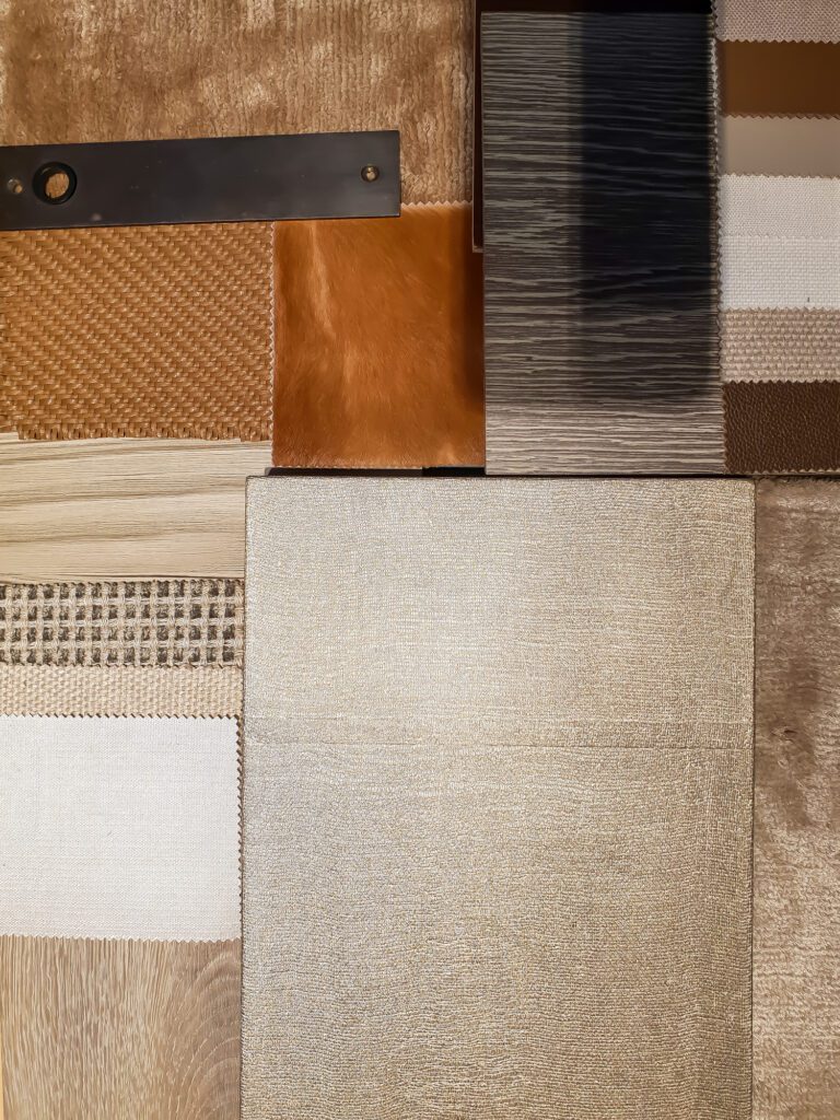
The best look is purposeful and flows. In doing so, regardless of the price of the home, the home looks intentional and custom. The easiest way to accomplish this is by pairing the paint with the carpet. A consistent paint and carpet combo is warm (undertones of honey) or cool (undertones of grey). The result is harmony among your core colors and a palette that is timeless and forever. Now all that is needed is a splash of color to bring it to life.
See digital Color Wall for more details regarding specific colors
Splash Color - Be Creative
Accent Colors
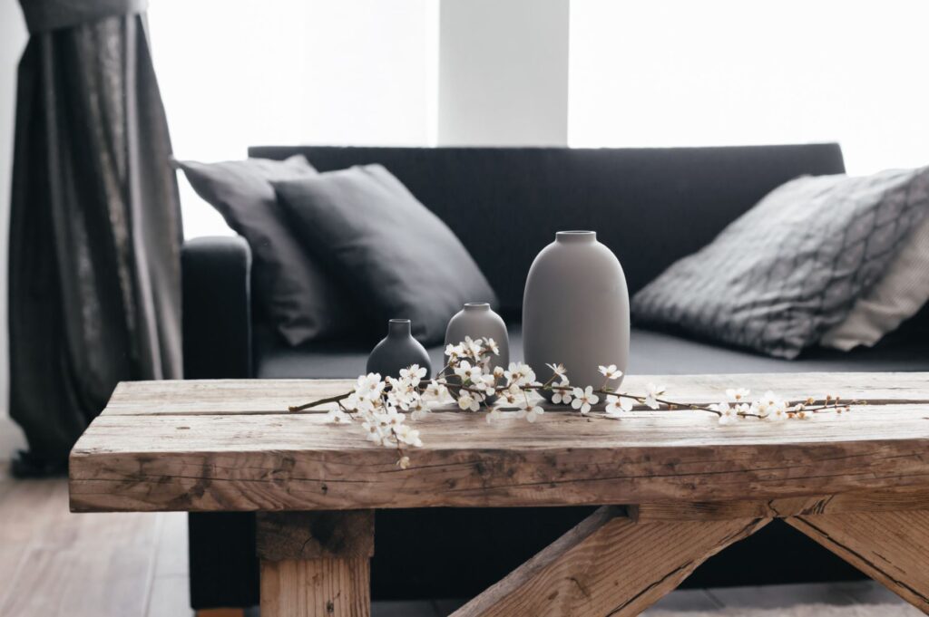
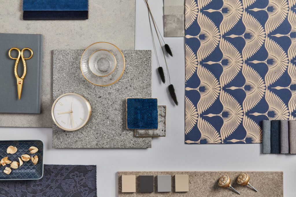
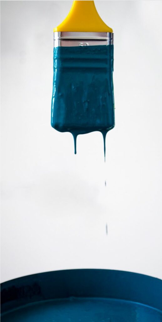
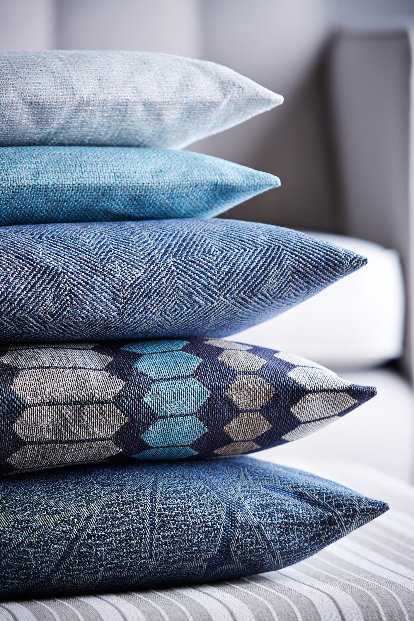
Have fun with the accent color. Pick a color that makes you happy while creating a relaxed feeling. Blue accents are very popular right now.
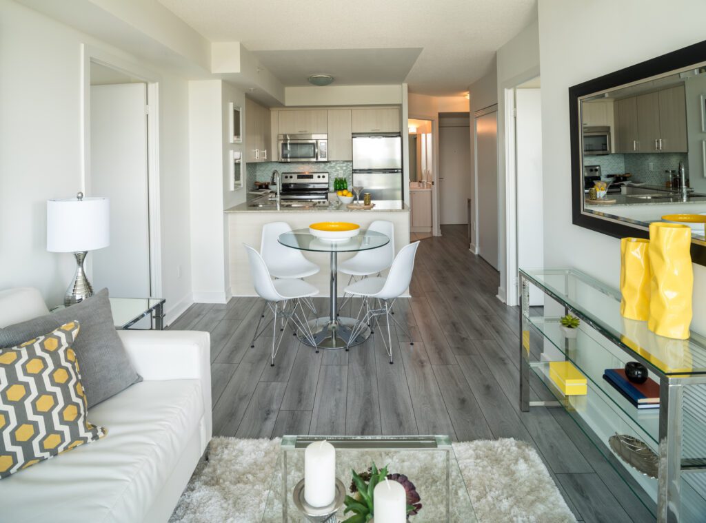
Once the accent color is selected, consistently splash the accent color in pillows, pictures, window coverings, place mats… to create an “ah ha” look.
The “smart designer look” is easy to maintain and change over time. Remember the walls and floors are paired and timeless. The accent color is easily changed for a new look.
Pros
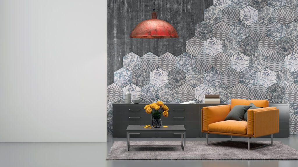
- Separate rooms without any construction. Large areas can become more spaces by simply adding an accent wall.
- Adds more color to a room, bringing variety and individuality.
- Gives you a chance to go bold without overwhelming the room.
- Creates a focal point in the room.
- Makes smaller rooms seem larger. By adding a dark and dramatic wall, it can add depth to the space creating a feeling of a larger space.
Cons
- Can be distracting.
- Too bright of colors can make the areas seem chaotic and cluttered.
- If the accent does not blend with the main focal point of the area, it can create an unbalanced style that can be overwhelming.
- Not every room needs an accent. It can make an area feel divided and not cohesive.
Light Vs Dark Color Values
Weighted Color Balance
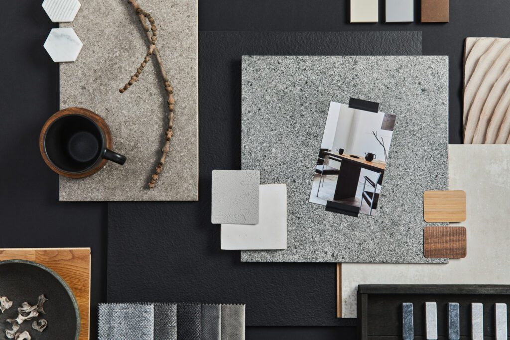
Purposeful design initiatives typically produce beautiful timeless results. Consider balance when deciding on the depth (light vs dark) of the carpet. A strong recommendation is a color palette that has a weighted value of 5 or 6 (in the middle). For instance both the carpet and the paint have a depth that is in the middle. Another option is off setting the paint or carpet with the opposite value. For instance, if the paint is darker (6 or 7) consider a carpet that is lighter (4 or 5). If the paint is lighter (2 or 3) pair it with a carpet that is a little darker (5 or 6). The end result is Balance and Beauty.
Consider the following Pro’s and Con’s when making a selection:
Dark Carpet Colors Pros and Cons
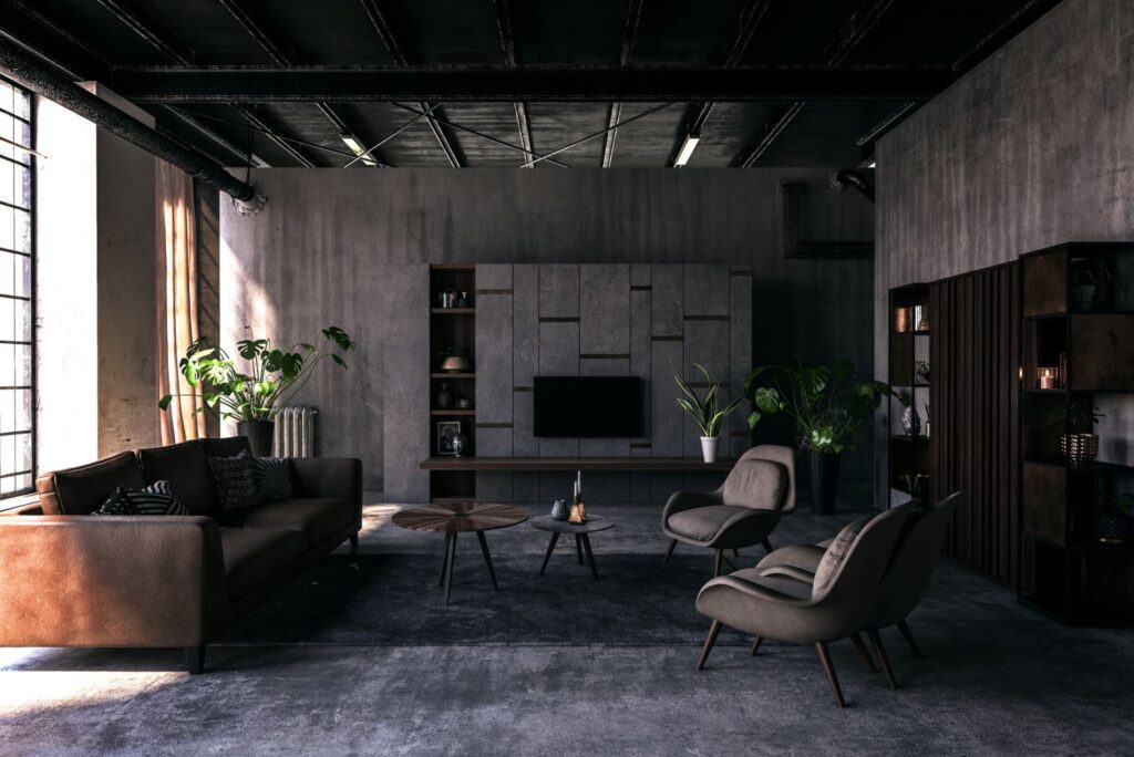
Dark carpet can help hide stains and add coziness to a room, but be mindful of how it can show dust, lint, and light–colored pet hair.
Pros
- Hides dirt and stains: The best carpet colors to hide stains are deep browns and grays because they camouflage spills of wine, pasta sauce, and other dark liquids. Dark colors also hide dirt and mud well (to a point!).
- Offer a cozy vibe: Dark carpet tends to make a room feel warmer and cozier. If you live in a cooler climate, dark carpet fosters an extra comfy vibe in a living room or bedroom.
- Hides carpet seams: Even with the expertise of a local carpet installer (www.angi.com/companylist/carpet, a seam or two may be visible, but darker colors tend to mask these seams better.
- Makes a statement: Many consider bold, darker carpets to be more eye–catching than light, neutral colors.
- Great for foot traffic coming from the outside: Deep tones are a top choice for entryways because dark carpet conceals dirt and mud.
- Less prone to fading: Darker colors absorb more light and contain more carpet dye (https://www.angi.com/articles/what–carpet–dye.htm), making them less likely to fade over time.
Cons
- Can make the room feel smaller: Darker colors tend to make the room feel smaller, while lighter carpets help the room feel expansive.
- Shows dust, lint, and light-colored pet hair more easily: Light–colored debris, including pet hair and lint, are more noticeable with dark carpet. You‘ll need to vacuum regularly to keep your carpet looking clean
- Makes it more difficult to remove a stain: While stains are less visible in dark carpet, oxidizing and stain removal products may lighten the carpet’s color and give your carpet obvious patches.
- Can show wear and tear more: Heavy indoor traffic areas, such as stairs or favorite spots in a living room, become obviously worn against other parts of dark carpets.
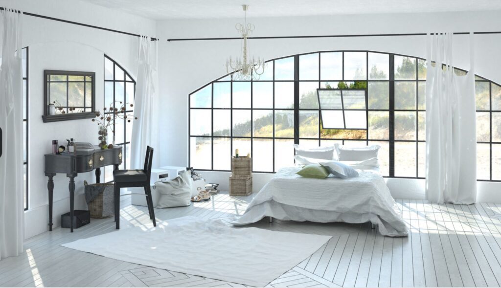
Light Carpet Colors Pros and Cons
A light-colored carpet often makes the room feel larger and more open. It can hide some dirt, too, especially if it‘s a textured design. But light–colored carpet shows spills easier and can fade over time.
Pros
- Makes the room feel larger: Lighter–colored tones tend to make the room feel bigger because they don‘t absorb as much light. Colors such as cream, beige, or light gray can make the room look spacious.
- Hides dirt, lint, and light-colored pet hair: Lighter carpets conceal lint, dirt, and pet hair, especially with a textured or speckled design.
- Brightens the space: Lighter tones reflect more sunlight, offering a more airy feeling.
- Easy to coordinate with furniture: Many feel that light carpet colors complement more furniture and accessory colors and styles. If you‘re planning on neutral tones for your decor, a lighter color carpet can offer more versatility.
Cons
- Doesn’t hide stains well: If a guest spills red wine or cranberry juice on a light–colored carpet, it‘ll be tough to conceal. Shows dirt and mud: Debris from pets, kids, food, and shoes show up easily on a light–colored carpet, so avoid these tones in entryways and dining rooms.
- Harder to hide dark-colored pet hair: If you have a cat or dog with black or dark brown hair, it‘ll show up easier on a light–colored carpet.
- May be too bright for rooms with direct sunlight: If your room gets plenty of sunlight, a very light–colored carpet might feel excessively bright.
Go For Gold
How do you tastefully integrate gold accents into a home with a grey paint palette and silver-toned hardware? Currently struggling with this.
Mixing metallics continues to be popular in home design schemes – and is here to stay for the long haul. Here’s a good rule of thumb if you want to incorporate this look: move forward with unabashed courage. If you just dip your toe in the water and use only a few metallic features in on the finish, things will look out of place. We way fully commit.
Tips
- To create a balanced and curated look, consider the visual balance
- Think about working pairs – if you change the pendants over your kitchen island, choose at least one other item in the kitchen to update
- Be mindful of texture: pull in pieces both matte and polished
- To incorporate metallics through on your flooring, consider carpets with a metallic accent yarn, or hard surfaces with a metallic accent. There are also metallic grout options available today for an extra-luxe appeal.
Tone on Tone
A popular and full proof design strategy is a Tone on Tone layering affect where several colors in the same family are used to create interest and dimension. When paired correctly with carpet (consistently cool or consistently warm) the appearance is a collaborative affect vs piece meal.
- Pair the Carpet with the Paint
- The Carpet and the Paint should be consistently warm (undertones of honey) or cool (undertones of grey)
- Throw in a splash of color as an accent and be consistent with the accent color.

